Stock research starts with a very basic question in your mind.... Do you have any plan to trade a stock?
PLAN What is this?
Let me explain you in this way, all we enter into the market to invest or speculate with our money for maximum capital utilization and profit maximization, right?
It's same as when we go out for shopping for anything which is required for household, we all have a plan in our mind about what we want to buy, how much quantity we need, what is good for us or not. The price we pay really delivers the true value of our money? I think all of us pass through with some thought process when we go for market.
Similar to this, in the stock market when we rush for any trade, same thing we pass out frequently. So many questions arise in our mind to be answered. Simply when we go for trade, we have to prepare a plan in our mind about trading the stocks.
Trading plan is something like “A preparation in our mind which comes up with research of the market and experience, when you trade in!.” I am stating here few questions you will come across when you go for a trade.
- In which instruments I would like to trade? Equity, F&O, currency or commodities.
- What are the stocks I should go for my trades?
- To make a profit what should be the entry point and exit point in my trades?
- Where should be a stoploss?
- What I suppose to hit the target and get out or end my trade or investment?
- How to face volatility of the market?
- What to do when the trade goes in the opposite of my direction?
- How do I assume the direction of the market either upside or downside? And so on….
The Answers to all the questions arise in your mind is the stock research. You can’t rely on the others opinion given on the television media, reports in the finance magazine or whatever the source you go behind with other’s faith, you should go through with your own research.
In my view the best way to deal in the market is this research at your own, set your objectives get trained your mind for decisions, comes up with your own strategies to trade in”.
The research past broadly classifies in two schools of thoughts or we can say in two philosophy.
Stock Research –
- Fundamental Analysis
- Technical Analysis
Fundamental research is a methodology where you research about the fundamental of company, economy, sectorial indexes/ Fundamental approach is all about the research of fundamental facts and financial data of the company and its environment. Such as, what is the business of company, its competency in market, what is the condition of market’s economy, how much the company’s growth down the years, how much the company has, what about its stake holders and management bodies, it’s functionality in operations its capital structure and all the facts and data related its business.
The logic behind this method is this, if a company has a good fundamental strength, the long-term prospects for the stock are also likely good, it is sound reasoning because fundamentally strong stocks have a built-in reason to go up those companies are making money, increasing their profits, and growing there business.
The problem with the fundamental analysis is that, it doesn’t address the current state of the stock. A good company and a good stock and not necessarily the same thing.
A company can be making money, increasing their revenue and profits, yet their stock could still be going down. In addition, the fundamental analysis is quite lengthy and subjective. It takes a lot of time and efforts to gather the information about the company and its business. So, for long term investment purpose it’s useful or I can say that it’s a basic requirement for investment you should know about the fundamentals of a company in which you are going to put money.
The second approach of stock research is Technical Analysis (TA) “Technical analysis is the study of market action, primarily through the use of charts, for the purpose of forecasting future price trends”. Market action includes the two primary information Price & volume.
The technical analysis is based on the three premises:
- Market actions discounts everything,
- Prices moves in trend,
- History repeat itself
It is quite flexible and accepting approach. You can apply its principle in any market, for any product, in any time frame.
Market Actions are divided into two parts :
1. Price Action
Opening Price (O)
Closing Price (C)
High (H)&
Low (L)
2. Volume
Opening price : When the market open for trading, the first price at which a trade executes is called opening price.
Closing price : The close price is the price where market ends in a period of time. It is most important price which indicates the summary of price action in a given time frame.
High : Represents the highest price at which the market participants were willing to transect at a given time period.
Low : Represents the lowest level which market participants were willing to transect at a given time period.
For technical analysis you have to view the price action and volume in a summarise way.
For example, if you want to analyze a stock’s last ten days prices (OHLC) open, high, low, close, its quite complex to store all of the data in a tabular manner.
Suppose that you want to analyze the year data of a stocks price action. It is next to impossible to analyze it without a proper format.
So chartings of OHLC data comes up to solve this problem. Charting your data in a proper manner can help you analyze it.
Charts have 3 types :
(1) Line chart
(2) Bar chart
(3) Candlestick charts
1. The line chart is the most basic chart type and its uses only one data point to form the chart. When it comes to TA, a line chart is formed by plotting the closing price of a stock or an index. A dot is placed for each closing price and then form a line connects these dots. Refer below image :

2. The Barchart on the other hand is a bit more versatile. A bar chart display all the four price/ variables namely open, high, low, close(OHLC). A bar has three components. -
Central Line - The top of the bar indicates the highest price the security has reached the bottom and of the bar indicates the lowest price for the same period. -
Left tick - Indicates the open price for a given period of time.
Right tick - Indicates the closing price for a given period of time.
Refer below image :

Barcharts displays all the four data point (OHLC) but it still lack a visual appeal.
It becomes really hard to spot the various price and their patterns.
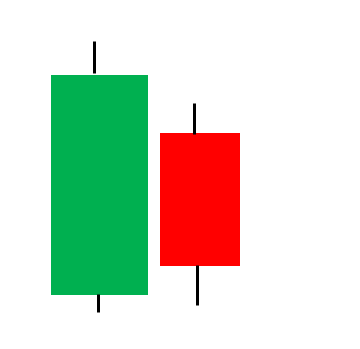
3. Japanes candlestick charts are the default option for majority of trades. As candlestick, charts also display the four vital information of price action in a systematic manner than bar charts,
The candle stick chart its made of by 3 components. -
The contral real body : It connects the open and close prices in a given time frame. -
The upper shadow : It display the high price during a given time frame.
The lower shadow : It display the low price during give time frame.
Refer below image

When open price is less than closing price then it indicates by bullish candle and if open price is greater then closing price then it indicates by bearish candle. Both bullish and bearish candle have a different colours for the real body most oftenly Bullish candle real body represent by the green colour and bearish real body by red colour.

Time frames
A time frames is defined as the time duration during which one choose to study a particular chart for eg. -
Monthly charts
Weekly charts
Daily charts
Intraday charts (5 min, 10 min, 30 Min, 1 hour)
As the names suggested that for a particular time frame the datas for candle is also changed according to the time frame. If you study the one month chart so the candle represents opening price at the start of the month, closing price at the close of the month, and high, low in the given month periods. So for all the time frame the data used for candle according Higher time frame charts represent the major price action and lower period charts usually represents the minor price actions.
Now I can summarise the leaning till yet in few points
● Technical analysis is a quick and easy tool to research about the future price action of a security, majority based on the learning from the past price behaviour market actions through charts.
● Charts is the key data storing tool . which work in a multiple time frame.
● Candle stick charts are more appropriate for observe and analysis because it summarise the key four elements of price action in a systematic manner.
To proceed for further understanding about technical analysis, I want to highlight few points here because it is necessary here to state few basic theoris to smooth our learning. -
Dow Theory
The basic stones of technical approach was set by the charles dow and edward jones in the starting of the last century.
We are not going to discuss the whole theory here but we should be aware of the basic tenets of the dow theory because it will help us to understand the approach better when we will move further…
Basic tenets of the Dow theory :
1. The Average discounts Everything.
2. The market has three trends Primary , Secondary and Minor.
3. Major trends have three phases : Accumulation, Public participation and Distribution phase
4. The Average must confirm each other
5. Volume must confirm the trend.
6. A trend is assumed to be in effect until it gives definite signal that it reversed.
The term “Trend” is offently used in TA. So first we have to understand the word trend its meaning & its implications. When you go through the chart and observe the price action in it. You will observe that the price of a security doesn’t move in a linear pattern. It swings regularly in any time frame.
Majorly the price action would be upside, downside or horizontal. So the movement of price action could be defined by the trend itself. In a general sense, the trend is simply the direction of market. Market moves in the Zig-Zag pattern on a series of ZigZag.
Uptrend - An uptrend would be defined as a series of successive higher peak and troughs.

Down trend- Down trend would be defined as as a series of declining peaks and troughs.

Sideways - If there is not uptrend or downtrend in markets then the phase is defined as side ways. Sideways market oftenly has horizontal peak and troughs sideway market is also referred as trendless market.

Most of the technical tools and system one trend following in nature which means they are designed for the market that are moving up or down. They work very poorly are not at all when market enters in the trendless phase. When market is rising buy the market go long when it is falling, sell the market or (go shout). When the market is moving sideways, stay away from the market. The trend has three classification remembers the Dows theory, the three categories are major, intermediate and term trends. There are infinite number of trends interacting with one another from the very shot term trends coming minutes and hour to super long trends lasting 50 years to 100 years. Major trend- Trend which are in effects for longer than a years. Intermediate or secondary- Trend which are in effects from three weeks to many months. Near trem trends – Defines as anything that lost less then two or three weeks. Each trend becomes a position of its next longer trend. For example a near term trend is the correction of an intermediate trend.
Support and Resistance
Support - Is the level or area on the chart under the market where buying interest is sufficiently strong to overcomes selling pressure.
Resistance - Represents a price level or area ones the market where selling pressure overcomes buying pressure.

The pictures shows above to find out the support and resistance level in an up and downtrend. Now we have quite a good knowledge about the market price action, that how the prices moves in market, is the market in trend or trendless phase, how to categories and identify a trend etc.
Now we forward to the further study of price action, or we can say price pattern to find out the buy and sell signals in it.
We know that the candlestick charts are more viable to understand the price action so we have to study the candlestick pattern and how they represent the market sentiments and buying selling signals.
Before we start the candlestick pattern, would like to mention a few assumption here. -
- Buy strength and Sell weakness
- Be flexible with pattern (quantity and verity)
- Look for a price trend
Candlestick pattern can be divided in two categories. Single candlestick Pattern or Multiple candlestick Pattern Pattern
As the name suggested, single candlestick patterns are formed by a single candlestick, and multiple candlestick patterns are forms by two or more candlestick.
Single Candlestick Pattern
1.The MARUBOZU : Because the candlestick charts are introduced by Japan so the glossaries used in patterns are also Japanese . In Japanese the MARUBOZU means ‘Bald’.
(a) Bullish MARUBOZU

Meaning :- Marubozu means the candle with no upper and lower shadow (therefore looking bald). Bullish Morubozu means the opening price would be equal to low and closing price would be equal to
Formation Indicates :- A bullish marubozu indicates that there is so much buying interest in the stock that the market participants were willing to buy the stock at every price point during the time frame so much. Therefore the stock price closed near its high point for the day it doesn’t matter what the prior trend has been earlier, the price action of the marubozu suggests that the sentiments has changed & now the stock is bullish.
(b)BEARISH MARUBOZU

Meaning :- Bearish marubozu means the open price would be equal to high & closing price would be equal to low.
Formation Indicates - A bearish marubozu indicates that there is so much selling pressure in the stock that the market participants actually sold at every price during the time frame so much. Therefore the stock closed near its low point of the day. It doesn’t matter what was the prior trend has been. The price action of the bearish marubozu suggests that the sentiments has changed and stock is now bearish.
2. The Spinning Tops :

Spinning tops are the very interesting pattern of candlestick. It doesn’t give you a specific entry or exit point but it reveals the sentiments of market regards the current situation in market.
Meaning :- Spinning tops looks like the above image. The candles have a small real body. · The upper & lower shadows are almost equal.
Formation Indicates :- The small real body indicates that there is a small difference in the opening & closing prices. There is no significance of a green & red candle. The matter here is a very small difference in open & close prices. The long upper & lower shadow indicates that the price in a given time frame swings vastly towards the upper side and lower side. The bullish did attempt to take the market highs and bearish did attempt to take the market lower simultaneously . But it didn’t work either the bulls or the bears were able to establish any influence on the market as this is evident with the small real body. It just conveys the indecision in the market because both (bulls & bearish) were not able to influence the market.
3. The dozi

The dozis are very similar to spinning tops, except that it doesn’t have a real body at all. This means that the open & close prices are almost equal . The upper & lower shadows can be of any length. The dozis have a similar implications as the spinning tops. It conveys indecision in the market.
4. Paper umbrella

Meaning :- The paper umbrella is a single candlestick pattern which helps trade settings up a directional trade .The interpretation of paper umbrella changes based on where it appears on the chart.
Formation Indicates :- A paper umbrella consist of two trend reversed pattern namely ". The hanging man pattern is bearish and the hammer pattern is relatively bullish. A paper umbrella is characterized by long lower shadow with a small upper body. If the paper umbrella appears at the bottom of a downtrend rally, it is called the "Hammer". If the paper umbrella appears at the top and of an uperand rally, It is called the "Hanging man".
Hammer:
Formation :- The bullish hammer is a significant candlestick pattern that occurs at the bottom end of the trend .The hammer consist of a small real body at the upper end of a trading range with a long lower shadow. The longer the lower shadow the more bullish the pattern.
✓ A hammer could be any color,it doesn't really matter.
✓ The prior trend for the hammer should be a down trend.
Formation indicates :- The market is in down trend ,where the bears are in absolute control of the market. - During a down trend every day the market would open lower compared to the previous day's close and again closes lower to form a new low. - On the day the hammer pattern forms, the market is a expected traded lower and make a new low. - However at a low point ,there is some amount of buying interest emerges which pushes the price higher to the extent that the stock closes near to the higher point of the day - The price action on the hammer day indicates that the bulls attempted to break the prices from falling further and they are reasonably successful. - This action by the bulls has the potential to change the sentiments in the stock hence one should look at buying opportunity.
Hanging man :
Formulation :- The bearish hanging man is a single candlestick and a top reversal pattern. The hanging man is classified a hanging man only if it is proceed by a uptrend. A hanging man can be of any color it doesn’t really matters.
Formation Indicates :-
✓ The market is characterized by the new highs and higher lows.
✓ The day the hanging man pattern appears in the chart, the bears have managed to make an entry.
✓ This is emphasized by a long lower shadow of the hanging man.
✓ The entry of bears signifies that they are trying to break the hold of bulls.
5. Shooting Star :

The shooting star pattern is an inverted version of paper umbrella.
Formulation :- The shooting star doesn’t have a lower shadow, but have a long upper shadow with a small real body it is a bearish pattern hence the prior trend should be bullish.
Formation Indicates :-
✓The stock is in uptrend implying that the bulls are in absolute control the stock are the market tends to make a new high & higher low.
✓On the day shooting star pattern forms the market as expected traded higher and in the process makes a new high.
✓However at the high point of the day, there is a selling pressure comes to an extent where the stock prices recedes to close near the low point of the day, thus forming a shooting star.
✓The selling indicates that the bears have made an entry and were successful in pushes price down this is evident by the long upper shadow.
Multiple candlestick patterns
1. The Engulfing pattern
The engulfing pattern needs two candles or two trading session to evolve . In a engulfing pattern you will find a small candle on day 1 and relatively long candle on day 2 which appear like if it engulf the candle on day 2. If the engulfing pattern appears at the bottom of a trend, it is called a bullish engulfing pattern. If the engulfing pattern appears at the top of a trend, it is called a bearish engulfing pattern.
The Bullish Engulfing pattern :-
✓ The prior trend should be a downtrend.
✓ The first day of pattern (P1) should be red candle reconforming the bearishness in the market.
✓The second day candle (P2) should be a green candle long enough to engulf the red candle.

Formation Indicates :-
✓ The market is downtrend with process steadly moving down.
✓ On the first day of pattern (P1) the market opens low and makes a new low this forms a red candle in the prices.
✓On the second day of pattern (P2) the stocks open near the closing price of P1, and attempt to make a new low. At the low of the day there is a sudden buying interest which drives the prices to close to higher than the previous day open price. This price action forms a large green candle.
✓ P2 suggests that the bulls made a very sudden and strong attempt to break the bearish trend. This is evident by the long blue candle on P2.
✓ The bullishness is expected to continue ones the next few successive trading session, hence the trades should look for buying oppourtunity.
The Bearish Engulfing pattern :-
✓ Prior trend should be a uptrend.
✓ The first candle should be a blue candle(P).
✓ The second candle of the pattern on day 2 should be long red candle.

Formation Indicates :-
✓ In a uptrend the bulls are in absolute control, pushing the prices higher.
✓ On P1, as expected market moves up and make a new high reconfirming the bullish trend in the market.
✓ On P2, as expected market opens the higher and attempt to make a new high, However at this point selling pressure start.
✓ The seller push the prices lower so much thus the stock closes below the P1 (Open).
✓ The strong sell on P2 Indicates that the bears may have successful break down the bulls strenght and the market may continue to witness selling pressure over the next few days.
2. The piercing pattern
The piercing pattern are very similar to the bullish engulfing pattern. In the bullish engulfing pattern P2's green candle engulf P1's red candle completely but in piercing pattern P2’s green candle partially engulf the P1’s red candle. Engulfing should be between 50% to less than 100%. Implication of this pattern is similar to bullish engulfing pattern.

3. The Dark cloud cover
The dark cloud coer is very similar to the bearish engulfing pattern with a minor variation. The P2 red candle engulfs P1 green candle, partially about 50% to less than 100%. The implication is same as bearish engulfing pattern.
THE HARAMI PATTERN
In old Japan harami means a pregnant woman, when you look on the pattern you will relate the word with pattern. The harami is a set of two candlestick pattern. The first candle is usually long and second candle has a relatively small body. The candles are in opposite in color.
BULLISH HARAMI PATTERN :-

Formation :-
✓ Appears in the bottom end of a trends.
✓ P1 is long red candle
✓ P2 is relatively small green candle.
Formation indicates :-
✓ The bears have a strong and absolute control over the market and pushing the prices lower.
✓ on day one of the pattern(P1) a red candle with new low is formed
✓ on day 2 of the pattern (P2) the market opens at a price higher than the previous day close.
✓ The market gain strength on P2 and manage to close on a positive note, thus forming a green candle. However P2 close price is lower than the P1 open price
✓ The price action on P2 create a small green candle which appears contained (pregnant) within P1 long red candle.
✓ The expectation is that the panic amongst the bear will spread, giving a greater push to bulls.
BEARISH HARAMI PATTERN :-
Formation :-
✓ Appears at the top end of an uptrend.
✓ P1 is a long blue candle.
✓ P2 is a relatively small red candle. Formation indicates:
Formation Indicates :-
✓ The bulls are in obsolute control over the market and pushing prices higher.
✓ on P1 the market trades higher and makes a new high and closes positively forming a blue candle day.
✓ On P2 the market unexpectedly opens lower which displays the Bulls and set a bit of panic in bulls.
✓ The market Continue s the trade lower to an extent where it manages to close negatively forming a red candle day.
✓ The expectation is that this negative drift is likely to continue Here is the list of some more pattern of trend continuation or trend reversal.


 Launch your Graphy